
CRESCI, Giovanni Francesco.
BY A LEADING WRITING MASTER
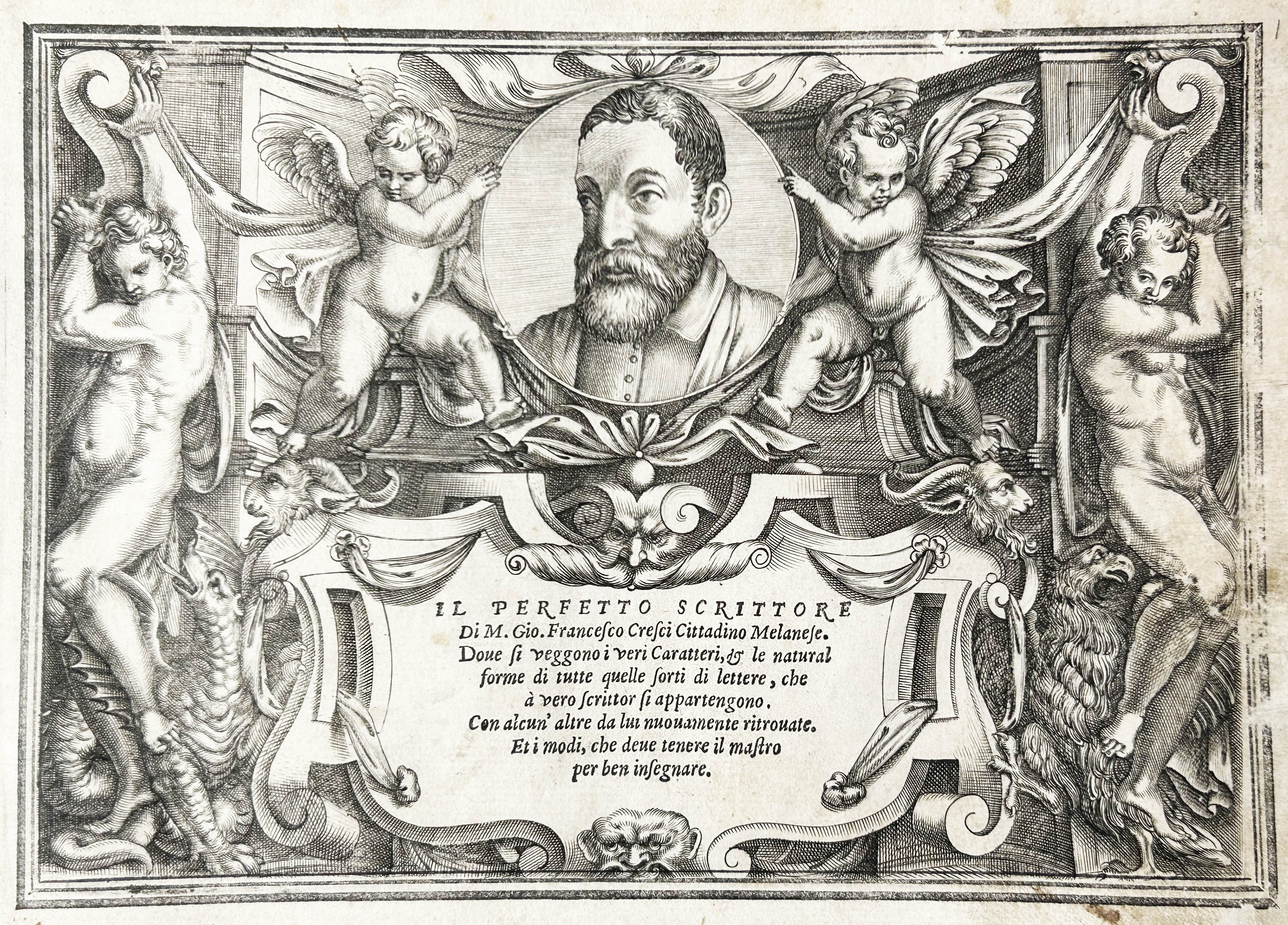
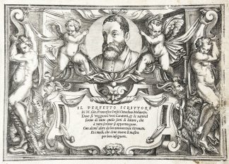
Il Perfetto Scrittore.
Rome, in casa del proprio autore & intagliato per l’Eccellente intagliator M. Francesco Aureri da Cremona, [1570]£5,250.00
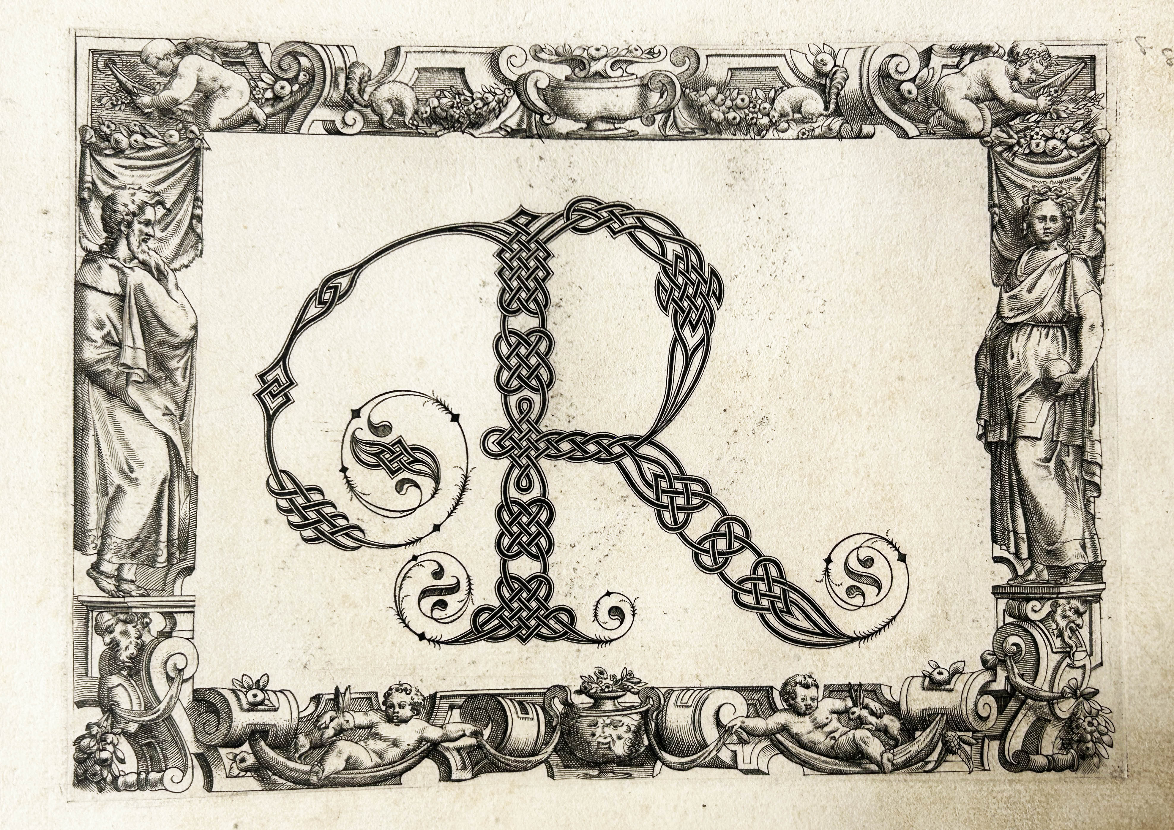
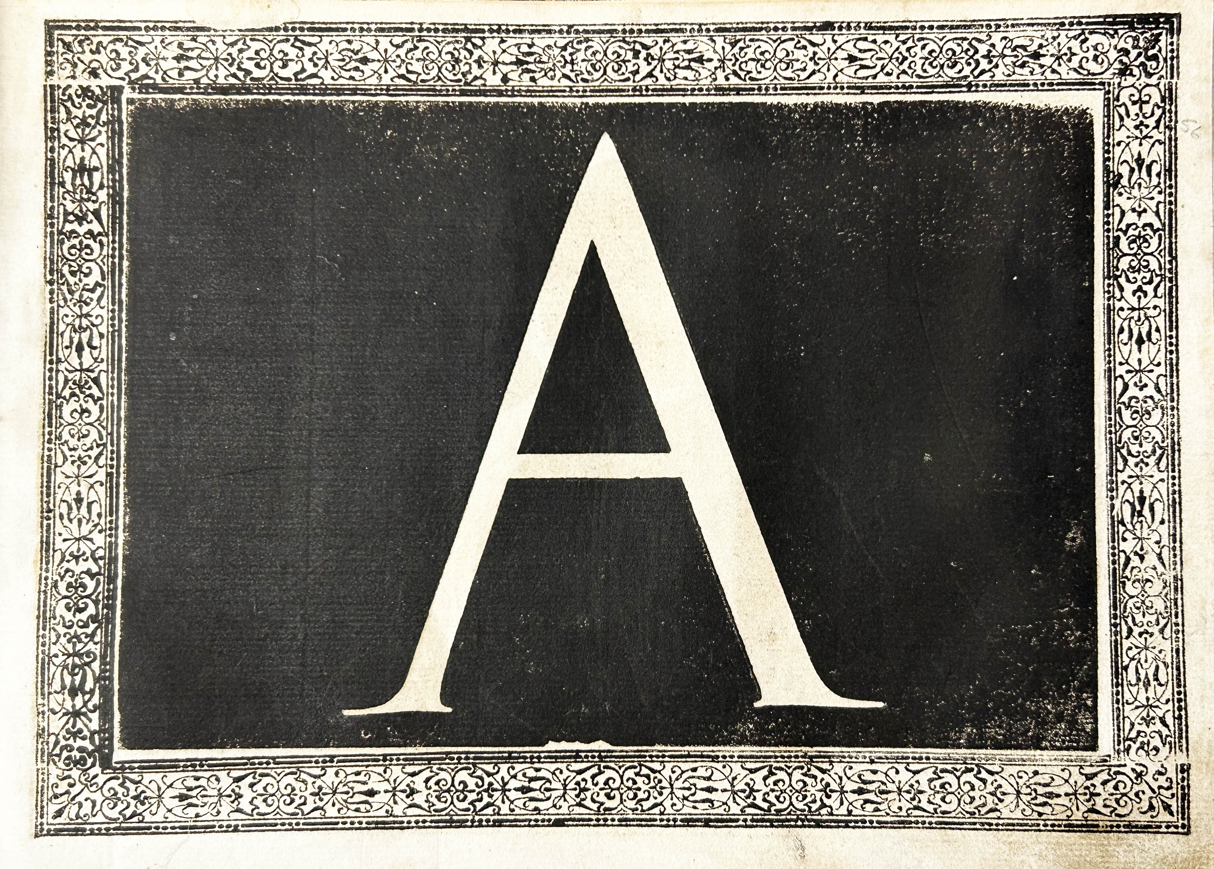
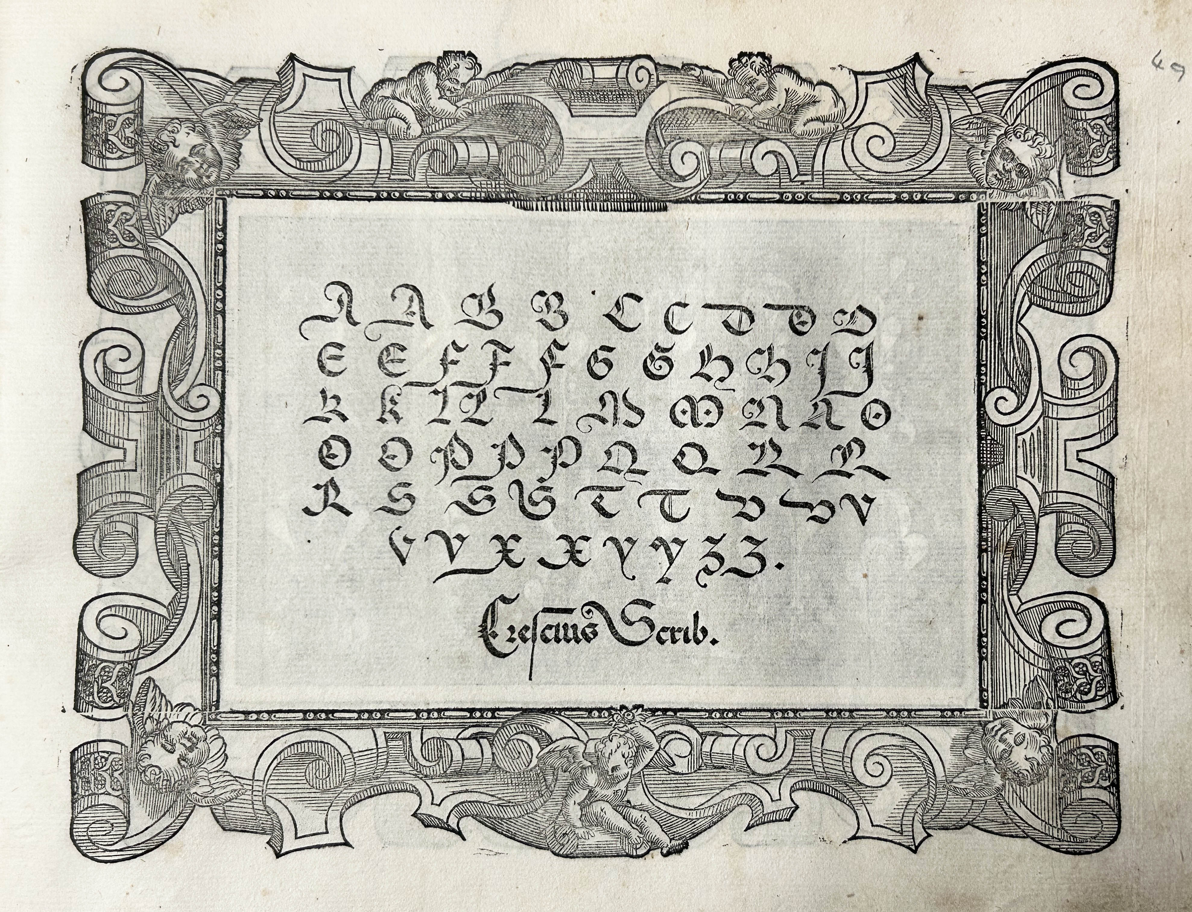
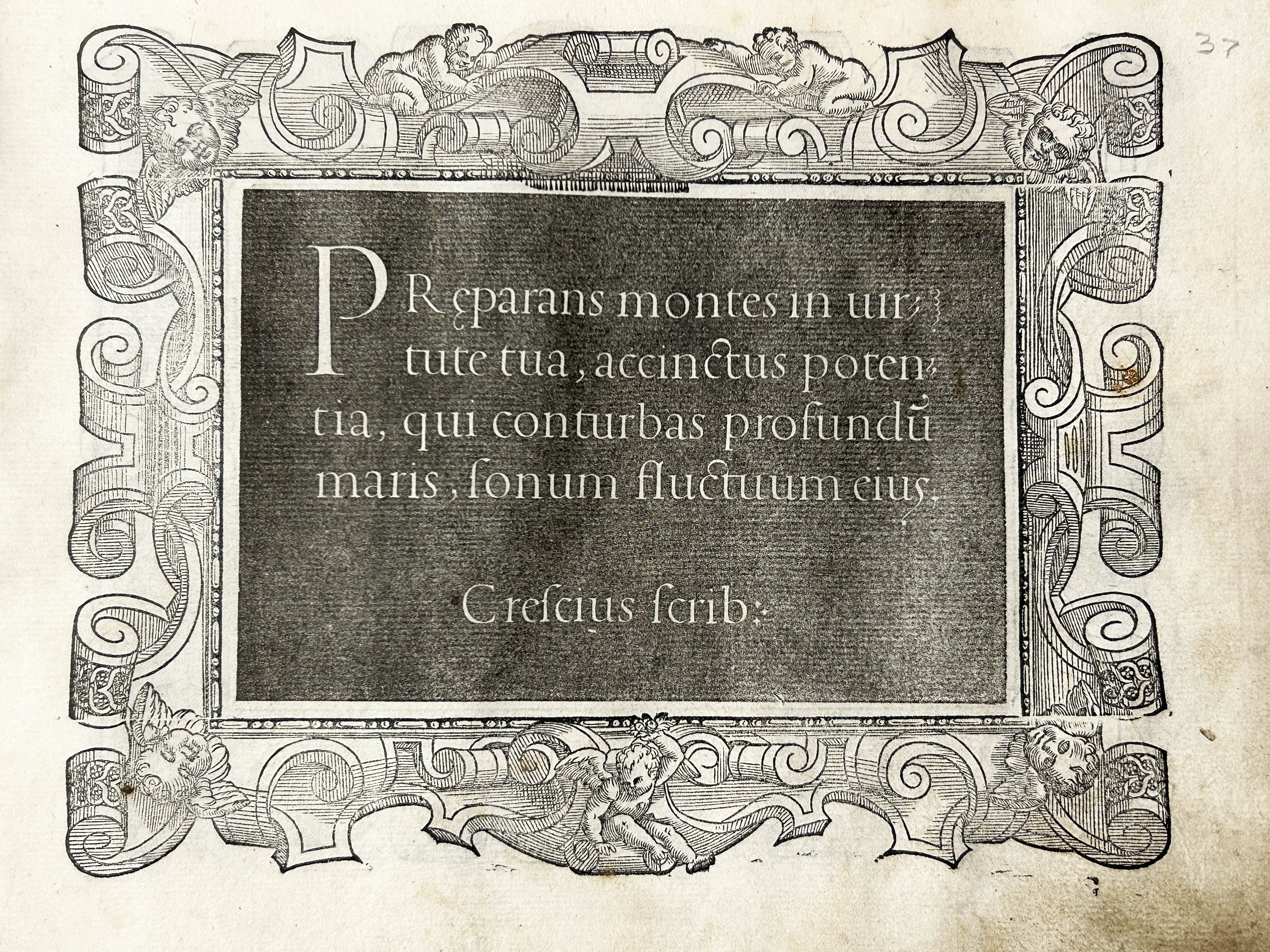
Oblong folio. 2 parts in 1, separate titles, I: ff. [49], pi2, *4, A-H4, I2, K-M4; II: ff. [42], pi2, **4 + 36 unsigned leaves. Part I lacking 2 unsigned ll. of plates, substantially misbound. First engraved title with author’s portrait surrounded by putti, second within woodcut architectural border (‘seconda parte’ anciently rubbed off), 79 ll. of plates with handwriting samples on recto and verso, within decorated woodcut borders, of which 23 large white-on-black (12 ll.) and 23 large grey-on-black woodcut letters (12 ll.), and 23 engraved letters (12 ll.) within architectural border (one anciently and finely pricked with a needle), decorated initials and ornaments. Margins of first t-p worn and lightly stained affecting frame, a few lower or outer margins of initial ll. and couple more repaired, frequent marginal finger-soiling, some light waterstains, some ll. a bit dusty, occasional foxing, age yellowing in places, small hole to plate ‘Delle Abbreviature Cancellaresche’ and next, touching couple of letters, crude repair to recto of plate ‘Della Lettera Ecclesiastica’ and two more nearby, not affecting reading. A perfectly acceptable copy in C19 green straight-grained morocco over marbled boards, spine gilt, lower hinge starting, extremities a bit scuffed, ms ‘Giuseppe Moratti riunì Li 8 Gennaio 1840’, couple of pen trials to last couple of plates.
‘One of the most superb, perhaps the finest, of the Italian writing manuals’ (Osley, p.72). This is its second edition, all early eds surviving in less than a dozen copies. At least two undated issues of the second edition are recorded, priority not established. This copy is without the 1571 papal privilege, confirming its 1570 printing date. Giovanni Francesco Cresci (fl. 2nd half of the C16) was appointed papal scribe in the Vatican Library in the 1550s, which he left in 1570. In 1560, he published his first calligraphic manual, ‘Il Perfetto Scrittore’, first printed in 1570, being his second. His fame rested on popularising a revised style of cancelleresca, developing from Palatino’s. The woodblocks were cut by the Spaniard Francesco Aureri da Crema. The final alphabet was engraved on copperplates, and it is ‘apparently the first example of copperplate engraving in an Italian writing book’ (Osley, p.78).
Part I comprises dozens of samples (texts, alphabets, and abbreviations) of the most important handwriting style and an introduction to good teaching methods for calligraphy. Among the scripts, each prefaced by a short introduction, are the cancelleresca, tonda, ecclesiastica (used for missals, antiphonaries, etc.), bollatica (used solely by Apostolic Scribes), mercantile bastarda (for letters and account books), and the lettera francese (for legal documents). His handwriting manuals were immediately popular throughout Europe, hence their scarcity. ‘From the late C16 onwards, Cresci’s cancelleresca formatella tended to be used in England instead of formal Palatinian Italic […] identified as ‘Roman’. […] [It] performed a very similar cultural function to that performed by Palatinian italic: the association with women, children, and scholars remained in place’ (Gibson, pp.43-5). Part II is devoted to Roman and decorated initials, with an initial introduction on the subject – 23 cut white-on-black, 23 cut white-on-grey, and 23 engraved. The difference in inking between the black-on-white and grey-on-white letters of Part II was the result of careful thinking in terms of perception and production. Cresci was aware that the white-on-black letters were ‘vulnerable to the excess inking of the day’ and was perhaps aware that ‘the white-on-black alphabet, with its dazzling contrasts, interfered with perception’ (Anderson, p.xxi). The engraved letter B was pricked with a needle early on, likely by an early owner transferring it onto fabric for embroidery or onto card for painting. A very attractive work.
Harvard, LC, Newberry, and Huntington copies recorded in the US. EDIT16 CNCE 14227. Casamassima, Trattati di scrittura, pp. 92-3; Bonacini, Bib. delle arti scrittorie, 426-27; Johnson, Catalogue of Italian writing books (Signature, n.s. 10 (1950), p. 22-47) pp.38-40; Becker, Practice of letters, 24; D. Anderson, A Renaissance Alphabet (1971); J. Gibson, ‘From Palatino to Cresci’, in Cultures of Correspondence in Early Modern Britain, ed. J. Daybell et al. (2016), pp.29-47.